# seaborn으로 시각화
# 그래프 객체
fig = plt.figure(figsize = (12, 5))
ax1 = fig.add_subplot(1, 2, 1)
ax2 = fig.add_subplot(1, 2, 2)

# 산점도
# 회귀선이 없는 산점도
sns.regplot(x = 'age', y = 'fare', # 변수 설정
            data = titanic, # 데이터 설정
            ax = ax1, # axe 객체 설정 = 위치 설정
            fit_reg = False)

# 회귀선이 있는 산점도
sns.regplot(x = 'age', y = 'fare', # 변수 설정
            data = titanic, # 데이터 설정
            ax = ax2, # axe 객체 설정 = 위치 설정
            fit_reg = True)

plt.show()

seaborn 으로 히스토그램, 밀도 함수 그래프
# 그래프 객체
fig = plt.figure(figsize = (18, 5))
ax1 = fig.add_subplot(1, 3, 1)
ax2 = fig.add_subplot(1, 3, 2)
ax3 = fig.add_subplot(1, 3, 3)

# 히스토그램 + 밀도함수 그래프
sns.distplot(titanic['fare'], ax = ax1)

# 밀도함수 그래프
sns.kdeplot(titanic['fare'], ax = ax2)

# 히스토그램
sns.histplot(titanic['fare'], ax = ax3)

# 제목 추가
ax1.set_title("fare 에 대한 히스토그램 & 밀도 함수")
ax2.set_title("fare 에 대한 밀도 함수")
ax3.set_title("fare 에 대한 히스토그램")

#
plt.show()
히트맵
# 피봇 테이블 먼저 생성
table = titanic.pivot_table(index = 'sex', columns = 'class', aggfunc = 'size')
table
# 히트맵
sns.heatmap(table,
            annot = True, # 데이터 값 표시 여부
            fmt = 'd', # 숫자 표현 방식 지정, d = 정수
            cmap = 'plasma', # 컬러맵
            linewidth = 1, # 구분선
            cbar = True) # 컬러바 표시 여부
plt.show()
범주형 변수 산점도
# 그래프 객체
fig = plt.figure(figsize = (12, 5))
ax1 = fig.add_subplot(1, 2, 1)
ax2 = fig.add_subplot(1, 2, 2)

# 범주형 변수 산점도
# 1) 분산 고려하지 않은 경우
sns.stripplot(x = 'class', y = 'age', data = titanic, ax = ax1)

# 2) 분산 고려한 경우
sns.swarmplot(x = 'class', y = 'age', data = titanic, ax = ax2)

# 제목 추가
ax1.set_title('클래스에 따른 연령의 분포 - 분산 고려하지 않음')
ax2.set_title('클래스에 따른 연령의 분포 - 분산 고려')

plt.show()
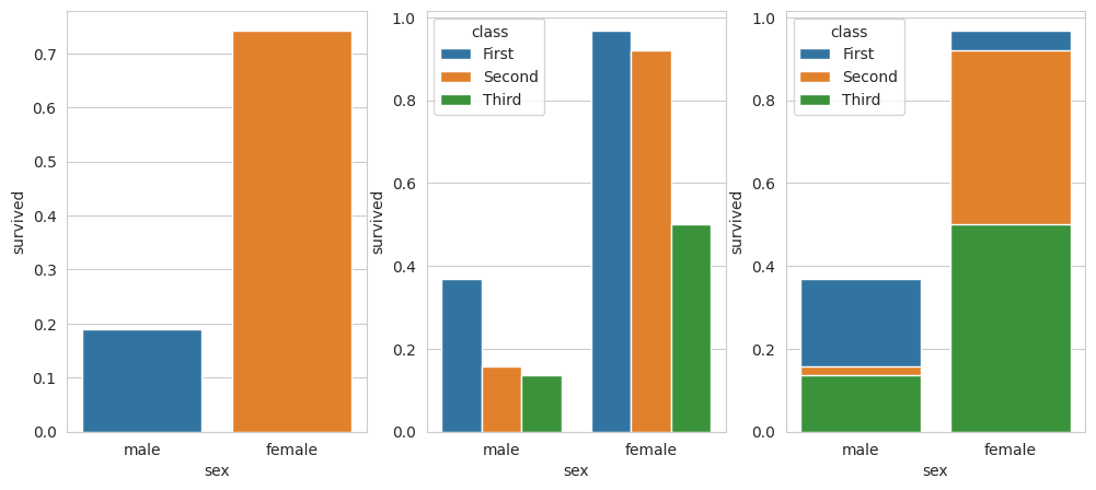
비율 막대 그래프
# 그래프 객체 생성
fig = plt.figure(figsize = (12, 5))
ax1 = fig.add_subplot(1,3,1)
ax2 = fig.add_subplot(1,3,2)
ax3 = fig.add_subplot(1,3,3)

# 막대 그래프 & 에러바
sns.barplot(x = 'sex', y = 'survived', data = titanic, ax = ax1)
sns.barplot(x = 'sex', y = 'survived', hue = 'class',
            data = titanic, ax = ax2)
sns.barplot(x = 'sex', y = 'survived',
            hue = 'class', dodge = False,
            data = titanic, ax = ax3)

# 줄 같이 생긴 것 = 에러바 (표준편차, 표준오차, 신뢰구간 등)
plt.show()
# 그래프 객체 생성
fig = plt.figure(figsize = (12, 5))
ax1 = fig.add_subplot(1,3,1)
ax2 = fig.add_subplot(1,3,2)
ax3 = fig.add_subplot(1,3,3)

# 막대 그래프 & 에러바 없이
sns.barplot(x = 'sex', y = 'survived', data = titanic, ax = ax1, errorbar = None)
sns.barplot(x = 'sex', y = 'survived', hue = 'class',
            data = titanic, ax = ax2, errorbar = None)
sns.barplot(x = 'sex', y = 'survived', hue = 'class', dodge = False,
            data = titanic, ax = ax3, errorbar = None)

# 줄 같이 생긴 것 = 에러바 (표준편차, 표준오차, 신뢰구간 등)
plt.show()
빈도 막대 그래프
# 그래프 객체 생성
fig = plt.figure(figsize = (12, 5))
ax1 = fig.add_subplot(1,3,1)
ax2 = fig.add_subplot(1,3,2)
ax3 = fig.add_subplot(1,3,3)

# 막대 그래프
sns.countplot(x = 'class', data = titanic, ax = ax1)
sns.countplot(x = 'class', hue = 'who',
              data = titanic, ax = ax2)
sns.countplot(x = 'class', hue = 'who', dodge = False,
              data = titanic, ax = ax3) # 그래프만 누적
#
plt.show()
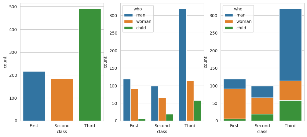
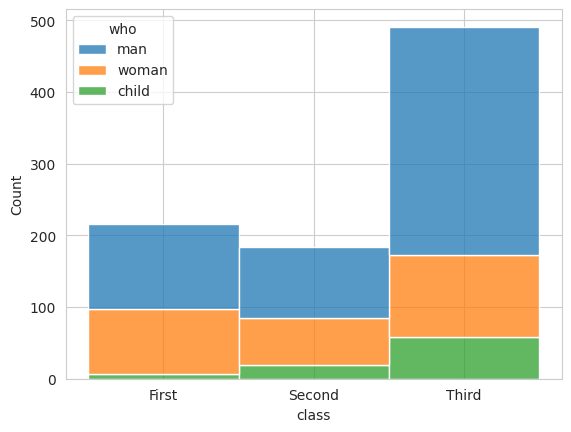
# 빈도 누적 그래프
sns.histplot(x = 'class', hue = 'who', multiple='stack',
              data = titanic) # 빈도 누적 = 전체합
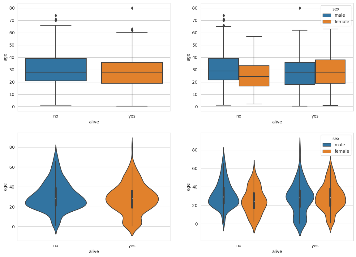
상자그림 & 바이올린 그림
# 그래프 객체 생성
fig = plt.figure(figsize = (14, 10))
ax1 = fig.add_subplot(2,2,1)
ax2 = fig.add_subplot(2,2,2)
ax3 = fig.add_subplot(2,2,3)
ax4 = fig.add_subplot(2,2,4)

# 상자 그림
sns.boxplot(x = 'alive', y = 'age', data = titanic, ax = ax1)
sns.boxplot(x = 'alive', y = 'age', hue = 'sex',
            data = titanic, ax = ax2)

# 바이올린 그림
sns.violinplot(x = 'alive', y = 'age', data = titanic, ax = ax3)
sns.violinplot(x = 'alive', y = 'age', hue = 'sex',
            data = titanic, ax = ax4)

#
plt.show()
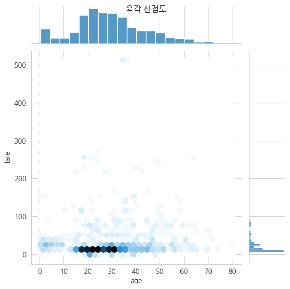
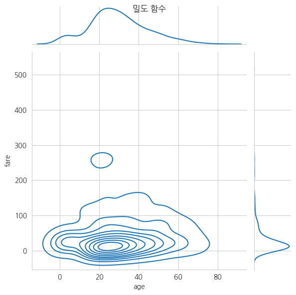
조인트 그림
# 한글 폰트 설정
plt.rc("font", family = "NanumGothic")

# 조인트 그림 - 산점도(기본값)
jp1 = sns.jointplot(x = 'age', y = 'fare', data = titanic)

# 조인트 그림 - 산점도 + 회귀선
jp2 = sns.jointplot(x = 'age', y = 'fare', kind = 'reg', data = titanic)

# 조인트 그림 - 육각 산점도
jp3 = sns.jointplot(x = 'age', y = 'fare', kind = 'hex', data = titanic)

# 조인트 그림 - 밀도 함수
jp4 = sns.jointplot(x = 'age', y = 'fare', kind = 'kde', data = titanic)

# 제목
jp1.fig.suptitle("산점도")
jp2.fig.suptitle("산점도 + 회귀선")
jp3.fig.suptitle("육각 산점도")
jp4.fig.suptitle("밀도 함수")

#
plt.show()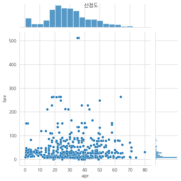
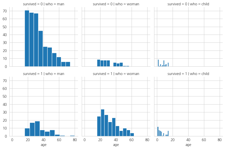
그리드 분할
# 그리드 분할 = 빈도표를 만들듯이 화면을 분할해서 시각화
grid = sns.FacetGrid(data = titanic,
                     row = 'survived',
                     col = 'who')

# 그래프 넣기
grid.map(plt.hist, 'age')

#
plt.show()
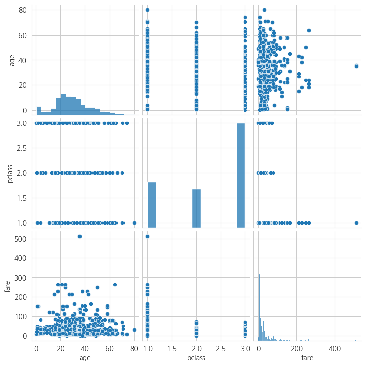
pairplot
# 변수들을 2개씩 짝을 지어서 시각화
pair_data = titanic[['age', 'pclass', 'fare']]

sns.pairplot(pair_data)

#
plt.show()
'Python > [시각화]' 카테고리의 다른 글
| [folium] 지도 시각화, 단계 구분도 (0) | 2023.06.18 |
|---|---|
| [matplotlib] 그래프 시각화(보조축, 2축 그래프, 히스토그램, 산점도) (1) | 2023.06.18 |
| [matplotlib] 그래프 시각화 2(선 그래프, 면적 그래프, 막대 그래프, 옵션 지정) (1) | 2023.06.18 |
| [matplitlib] 그래프 시각화 (0) | 2023.06.16 |