선그래프
# 기본값 kind = 'line'
df_new_t.plot() # 보통 x 축에 시간이 옴

막대그래프
수직막대그래프
df_new.plot(kind = 'bar')

수평막대그래프
# 수평 막대 그래프
df_new.plot(kind = 'barh')
df_new_t.plot(kind = 'barh')

히스토그램
df_new_t.plot(kind = 'hist')

산점도
# 차중과 연비의 산점도
df.plot(kind = 'scatter', x = 'mpg', y = 'weight')

상자수염그림
df[['mpg', 'acceleration']].plot(kind = 'box')
[시도별 전출입 인구수]
데이터 전처리 및 시각화
# 라이브러리 불러오기
import pandas as pd
import matplotlib.pyplot as plt

# 데이터 불러오기
df = pd.read_excel('/content/drive/MyDrive/hana1/data/시도별 전출입 인구수.xlsx',
              engine = 'openpyxl')
df.head()
# NaN 값 채우기
df = df.fillna(method = 'ffill')

# 서울시에서 다른 지역으로 이동한 인구 데이터
# 불 인덱스(True)를 데이터 추출
b_ind = (df['전출지별'] == '서울특별시') & (df['전입지별'] != '서울특별시')
df_seoul = df[b_ind]
df_seoul.head()
# 전출지별 열 삭제
df_seoul = df_seoul.drop('전출지별', axis = 1)

# 열 이름 변경
df_seoul = df_seoul.rename({'전입지별' : '전입지'}, axis = 1)

# 행 인덱스 변경
df_seoul = df_seoul.set_index('전입지')

df_ggd = df_seoul.loc['경기도']
# 선 그래프
plt.plot(df_ggd.index, df_ggd.values)

plt.plot(df_ggd)

##  결과 동일
# 그래프 꾸미기
# 차트 제목, 축 제목 추가
# 한글 폰트 지정
plt.rc("font", family = 'NanumGothic')

# 스타일 서식
plt.style.use('ggplot')

# 그림 사이즈 지정(가로, 세로)
plt.figure(figsize = (13, 5))

# x축 눈금 라벨 회전
plt.xticks(rotation = 'vertical')

 # 선그래프
plt.plot(df_ggd.index, df_ggd.values)

 # 차트 제목 추가
plt.title('서울시에서 경기도로 이동하는 인구')

 # 축 제목 추가
plt.xlabel("기간(연도)")
plt.ylabel('이동 인구 수')
# 범례 추가
plt.legend(labels = ["서울시 => 경기도"], loc = 'best')
plt.show()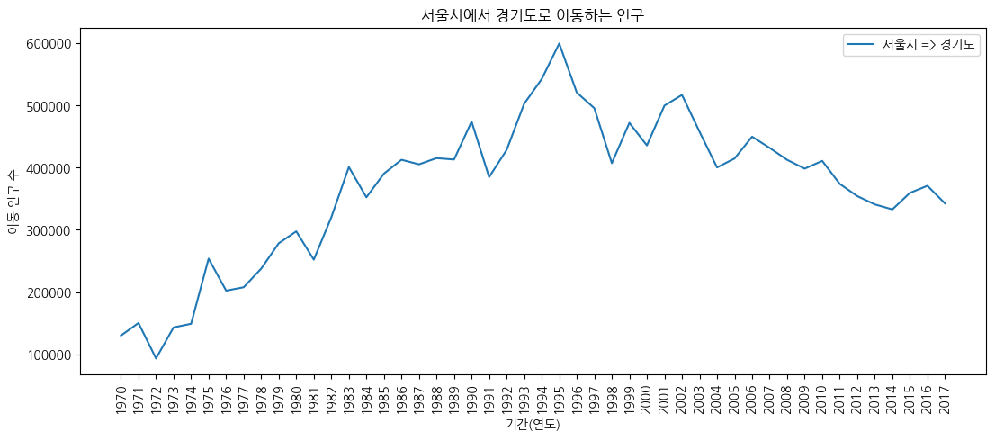
# 스타일 서식
plt.style.use('ggplot')

# 그림 사이즈 지정(가로, 세로)
plt.figure(figsize = (13, 5))

# x 축 눈금 라벨 회전
plt.xticks(rotation = 'vertical')

# 선 그래프
plt.plot(df_ggd.index, df_ggd.values)

# 차트 제목 추가
plt.title("서울시에서 경기도로 이동하는 인구")

# 축 제목 추가
plt.xlabel("기간(연도)")
plt.ylabel("이동 인구 수")

# 범례 추가
plt.legend(labels = ["서울시 => 경기도"], loc = 'best')

# y축 범위 조정
plt.ylim(50000, 800000)

# 주석 추가
# 화살표
plt.annotate("", xy = (23, 620000), # 화살표 머리
             xytext = (5, 250000), # 화살표 꼬리
             xycoords = 'data', # 좌표계
             arrowprops = dict(arrowstyle = '->', color = 'red', lw = 8))
plt.annotate("", xy = (45, 400000), # 화살표 머리
             xytext = (29, 620000), # 화살표 꼬리
             xycoords = 'data', # 좌표계
             arrowprops = dict(arrowstyle = '->', color = 'blue', lw = 8))

# 텍스트
plt.annotate("인구 이동 증가",
             xy = (12, 420000), # 텍스트 시작 위치
             rotation = 25, # 회전
             va = 'baseline', # 위아래 정렬
             ha = 'center', # 좌우 정렬
             fontsize = 10)
plt.annotate("인구 이동 감소",
             xy = (37, 510000), # 텍스트 시작 위치
             rotation = -18, # 회전
             va = 'baseline', # 위아래 정렬
             ha = 'center', # 좌우 정렬
             fontsize = 10)
# 그래프 객체 만들기
fig = plt.figure(figsize = (20, 10))
ax1 = fig.add_subplot(2, 2, 1) # 행의 개수, 열의 개수, 위치
ax2 = fig.add_subplot(2, 2, 2)
ax3 = fig.add_subplot(2, 2, 3)
ax4 = fig.add_subplot(2, 2, 4)

# axe 객체에 그래프 추가
ax1.plot(col_years, df_4.loc['충청남도', :],  marker = 'o', markerfacecolor = 'green',
         markersize = 5, color = 'green', label = "서울 => 충남")
ax2.plot(col_years, df_4.loc['경상북도', :],  marker = 'o', markerfacecolor = 'red',
         markersize = 5, color = 'red', label = "서울 => 경북")
ax3.plot(col_years, df_4.loc['강원도', :],  marker = 'o', markerfacecolor = 'yellow',
         markersize = 5, color = 'yellow', label = "서울 => 강원")
ax4.plot(col_years, df_4.loc['전라남도', :],  marker = 'o', markerfacecolor = 'blue',
         markersize = 5, color = 'blue', label = "서울 => 전남")

# 범례 추가
ax1.legend(loc = 'best')
ax2.legend(loc = 'best')
ax3.legend(loc = 'best')
ax4.legend(loc = 'best')

# x 축 눈금 라벨 회전
ax1.set_xticklabels(col_years, rotation = 90)
ax2.set_xticklabels(col_years, rotation = 90)
ax3.set_xticklabels(col_years, rotation = 90)
ax4.set_xticklabels(col_years, rotation = 90)

# y 축 범위 조정
ax1.set_ylim(0, 60000)
ax2.set_ylim(0, 60000)
ax3.set_ylim(0, 60000)
ax4.set_ylim(0, 60000)

# 스타일 서식
plt.style.use('ggplot')
plt.show()
'Python > [시각화]' 카테고리의 다른 글
| [folium] 지도 시각화, 단계 구분도 (0) | 2023.06.18 |
|---|---|
| [seaborn] 시각화(산점도, 히스토그램, 히트맵, 비율 막대 그래프, 빈도 막대 그래프, 상자 그림, 바이올린 그림, 조인트 그림, 그리드 분할, pairplot) (0) | 2023.06.18 |
| [matplotlib] 그래프 시각화(보조축, 2축 그래프, 히스토그램, 산점도) (1) | 2023.06.18 |
| [matplotlib] 그래프 시각화 2(선 그래프, 면적 그래프, 막대 그래프, 옵션 지정) (1) | 2023.06.18 |