[python] 데이터 시각화
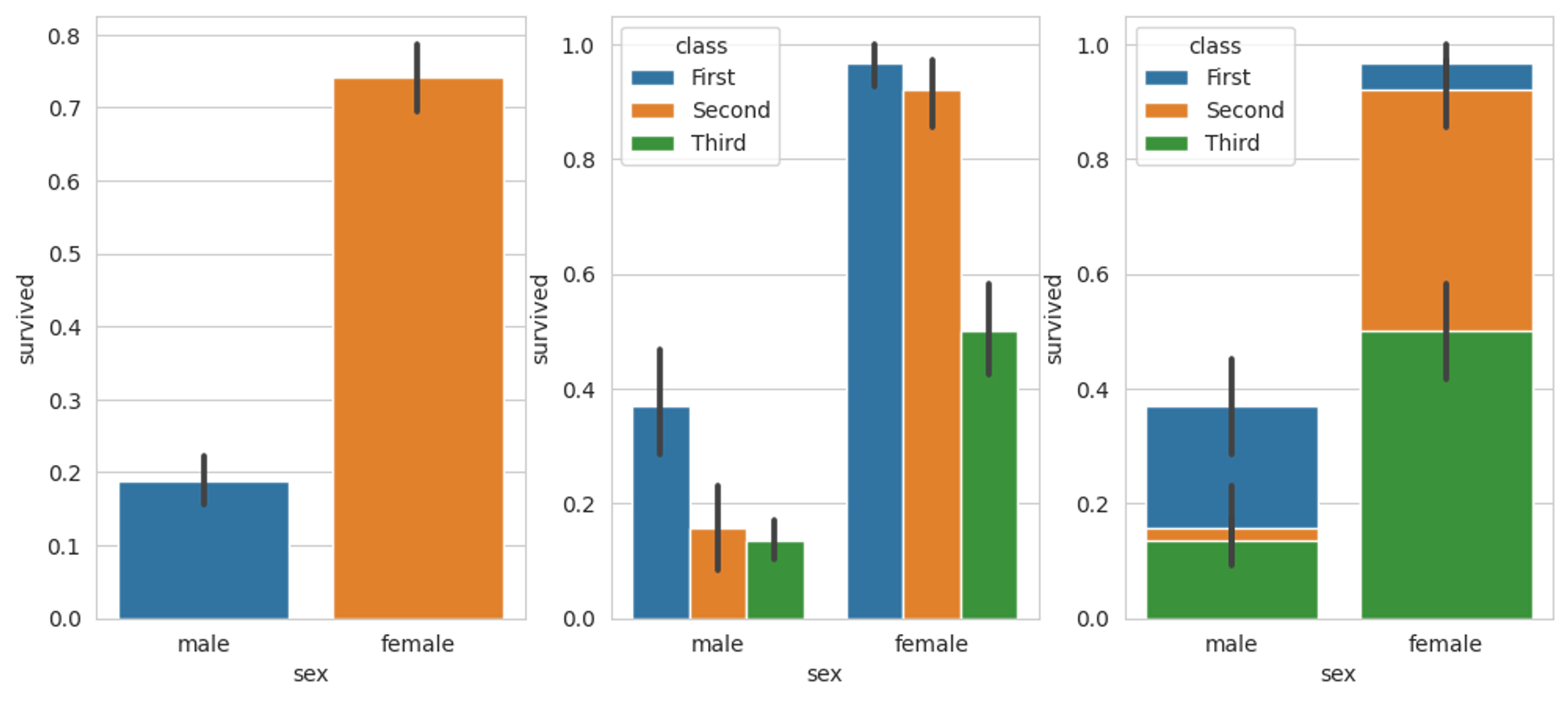
seaborn ✔️ 비율막대그래프 from matplotlib import axes # 그래프 객체 생성 fig = plt.figure(figsize = (12, 5)) ax1 = fig.add_subplot(1, 3, 1) ax2 = fig.add_subplot(1, 3, 2) ax3 = fig.add_subplot(1, 3, 3) # 막대 그래프 & 에러바 sns.barplot(x = 'sex', y = 'survived', data = titanic, ax = ax1) sns.barplot(x = 'sex', y = 'survived', hue = 'class', data = titanic, ax = ax2) sns.barplot(x = 'sex', y = 'survived', hue = 'clas..